SMART APOTEKA
BRANDING AND GUIDELINES
Smart Apoteka (apoteka means pharmacy) needed an identity built from nothing: a mark that reads as care before it reads as retail, holds up at the size of an app icon or a receipt header, and still works when it is cut from metal and lit up on a shopfront. I designed the whole brand, from the first sketches of the symbol to the logo, the brand guidelines and the shopfront signage.
The symbol came out of more than 260 artboards of exploration. The final mark sets a heart over two linked circles, so it reads as care, as a cross and as a four leaf clover at once, and it keeps its shape as a solid, an outline or a single colour. The guidelines lock down logotype construction, the symbol grid, colour, reverse usage and typography, and I prepared the artwork for extrusion so the sign maker could build it as illuminated 3D lettering.
Services
Logo Design, Brand Guidelines, Signage DesignClient
Smart ApotekaSYMBOL EXPLORATION
Every route I explored for the symbol, grouped by idea: hearts, arrows, pills, crosses, leaves and monograms, refined and recombined until one idea held up at every size. Hover to enlarge, click to see it full size.








































































































































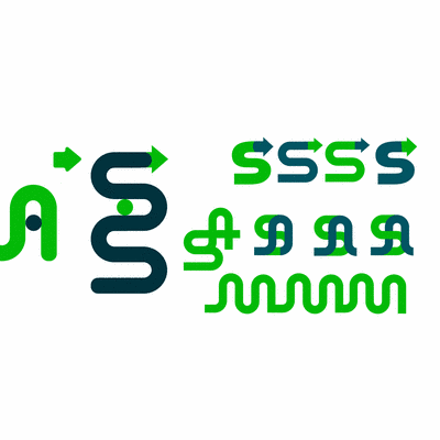
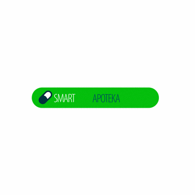











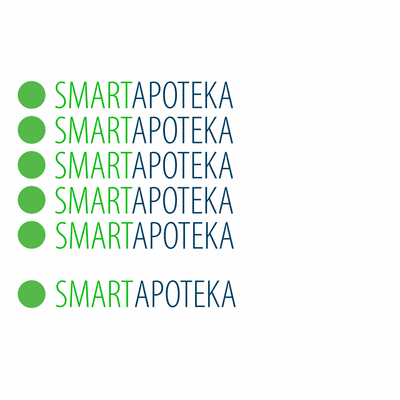





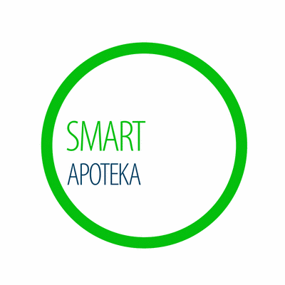

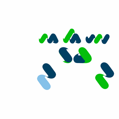





167 symbol artboards from the working file, in 7 groups.
WORDMARK EXPLORATION
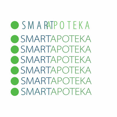
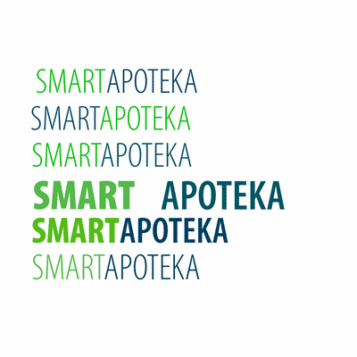
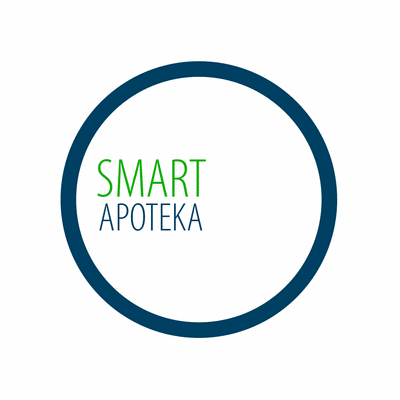
Pairing the symbols with the name: weight, case, spacing and how SMART and APOTEKA sit together, tested as complete lockups rather than as type on its own.


















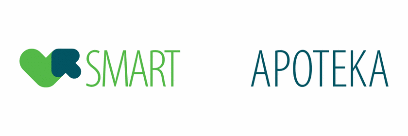









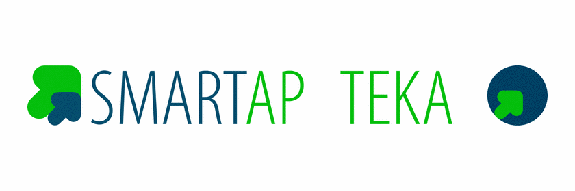







































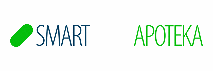


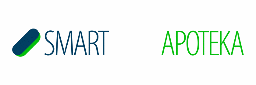











83 lockup artboards.
THE FINAL MARK
A heart over two linked circles. Full colour, full colour with a keyline for busy backgrounds, and the single colour versions for reverse and whiteout use.




BRAND GUIDELINES
Logotype construction, the symbol on its grid, colour, reverse usage and typography, set out so printers, sign makers and web developers all build the same brand.

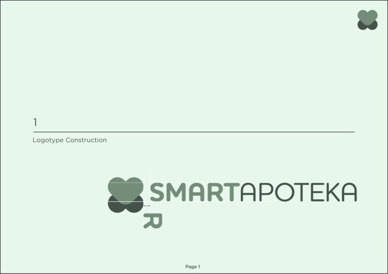
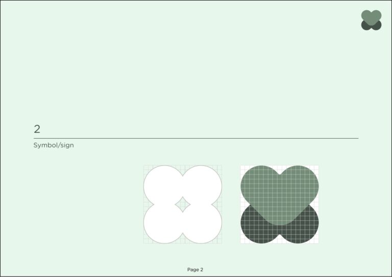
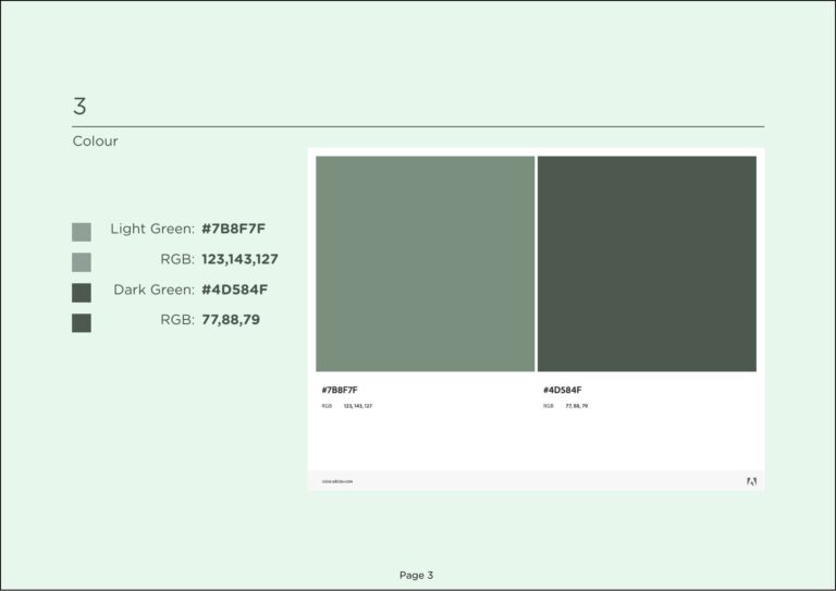
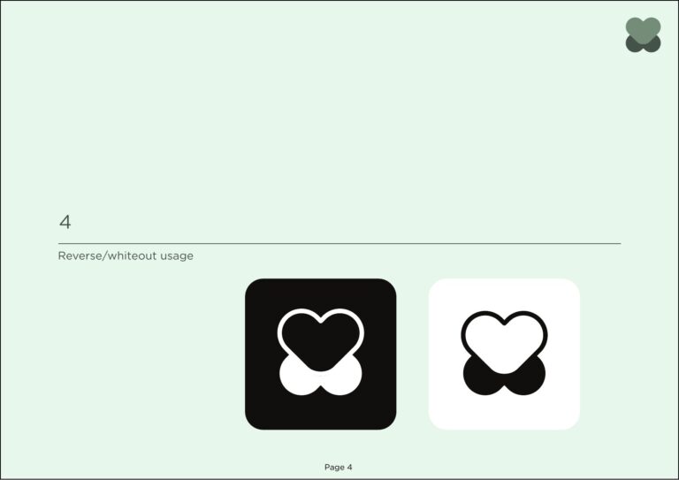
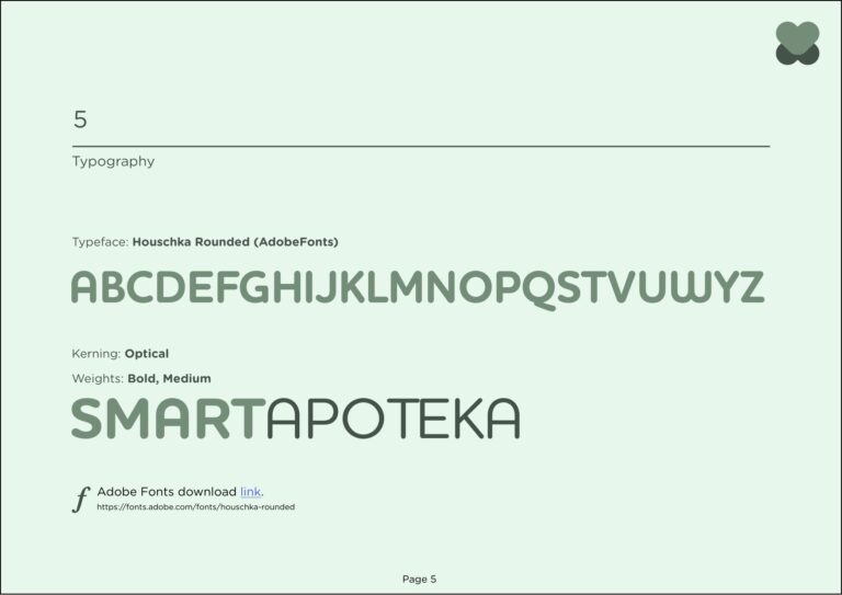
Smart Apoteka Design Guidelines, version 1.0.
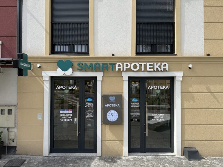
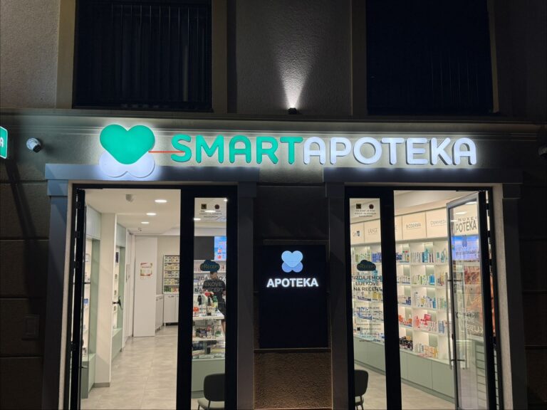
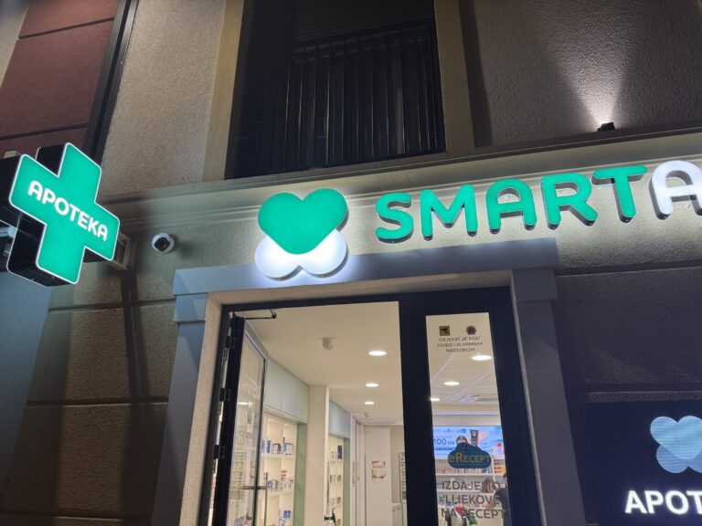
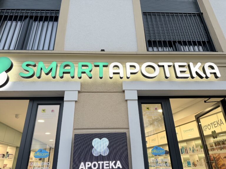
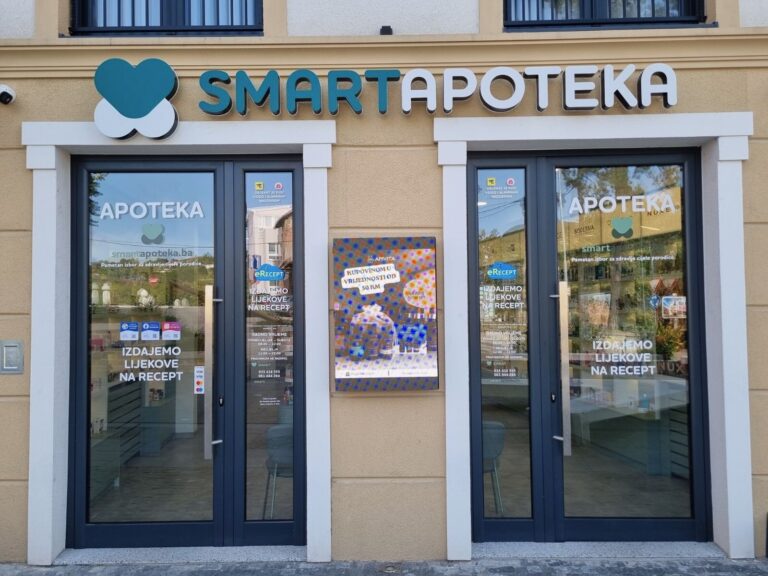
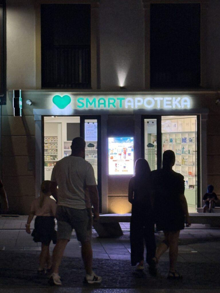
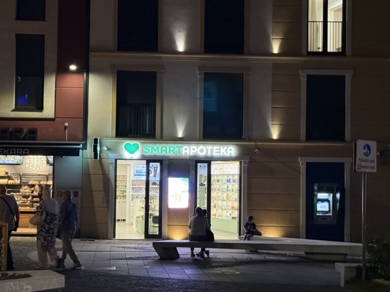
IN SITU: EXTERIOR
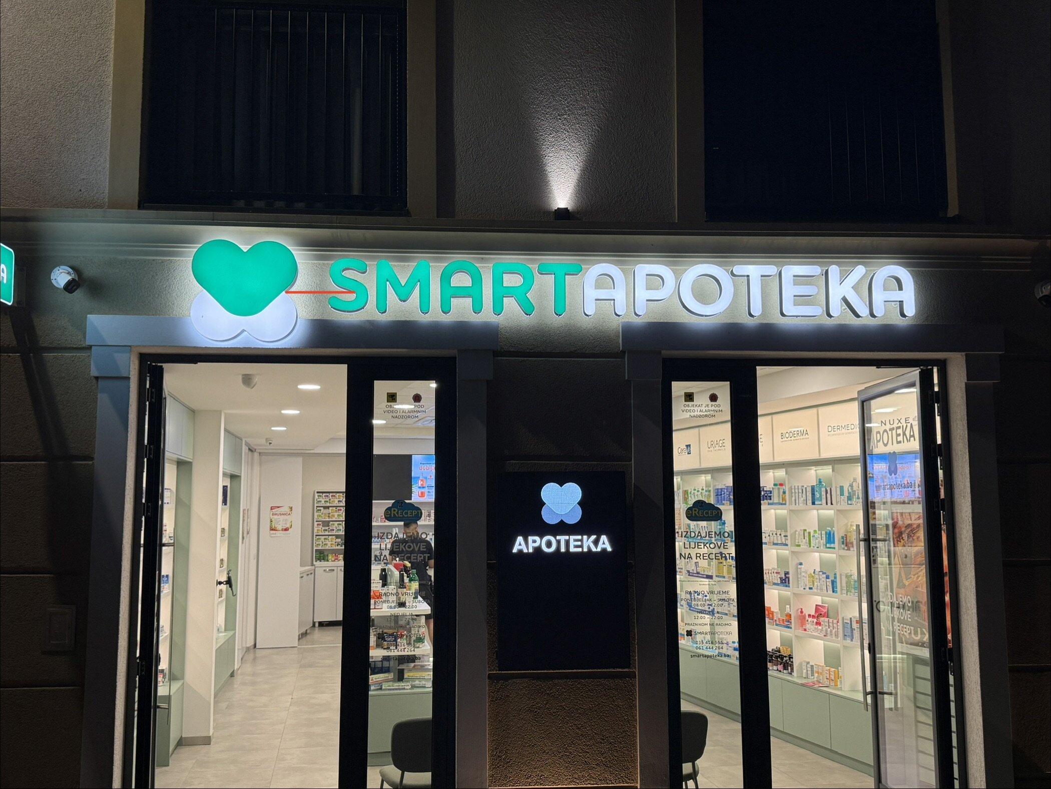
The finished shopfront, built from the extrusion artwork: illuminated 3D fascia lettering and a projecting pharmacy cross, by day and by night.
IN SITU: INTERIOR
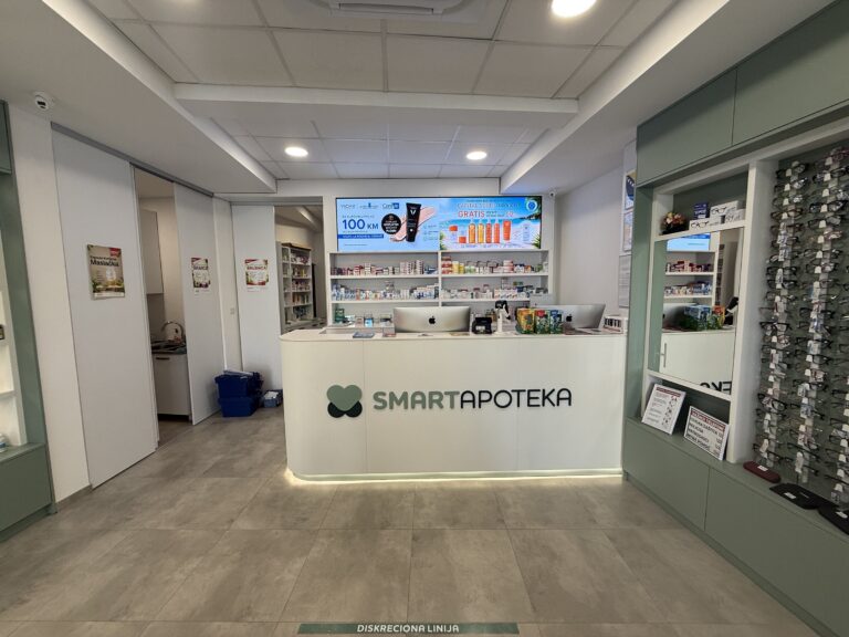
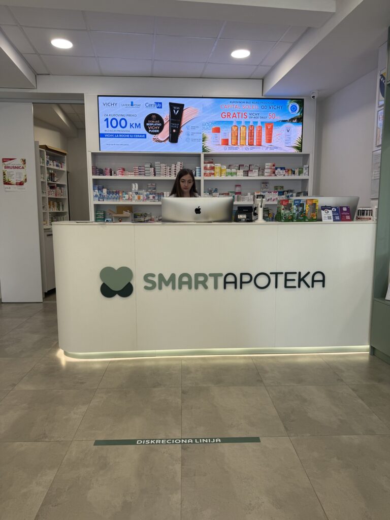
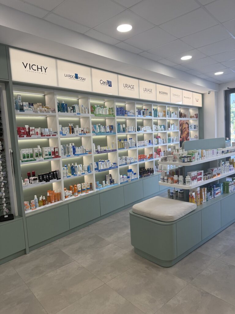
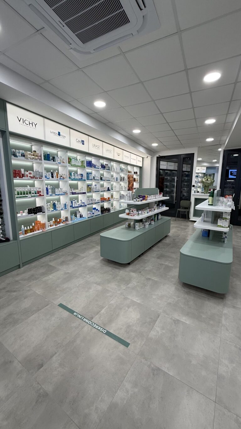
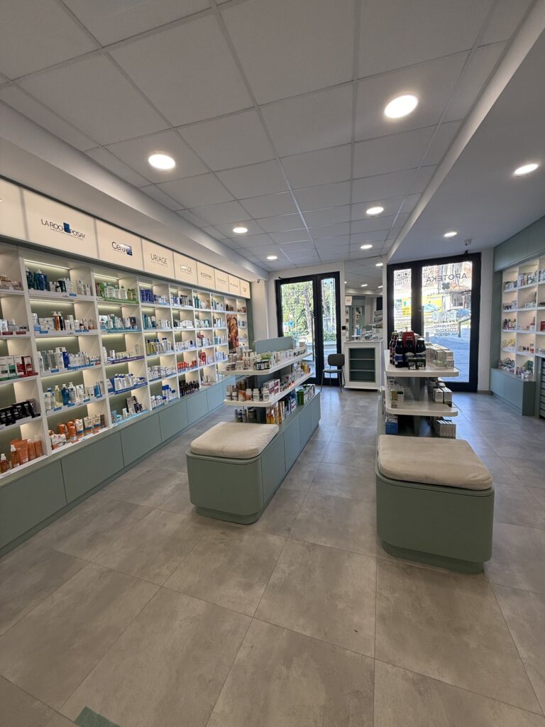
The brand carried inside, from the backlit reception desk to the shop floor.