DIGITAL CONSISTENCY

In 2021 PizzaExpress overhauled its entire digital presence with the agency Truant, the brand’s first redesign since 2006. The old site had been built in ’06 and had functionality bolted on ever since, so in practice this was a design from scratch. The roundel logo was the only asset carried over.
I was responsible for the UI and UX across that whole presence: the website, online and digital menus, email campaigns and receipts. To keep it consistent as the new look rolled out across PizzaExpress, its Irish sister brand Milano and platforms like Click & Collect and Pay at Table, I also wrote the Digital Consistency guidelines below. They set the rules for navigation, logo placement, CTAs, modals, menus, and header and footer variations.
Services
Ui, Ux, Digital Menus, Online Menus, Email Campaigns, Receipts, Website Design, Author of the Digital Design GuidelinesClient
PizzaExpressAgency
Truant1NAVIGATION
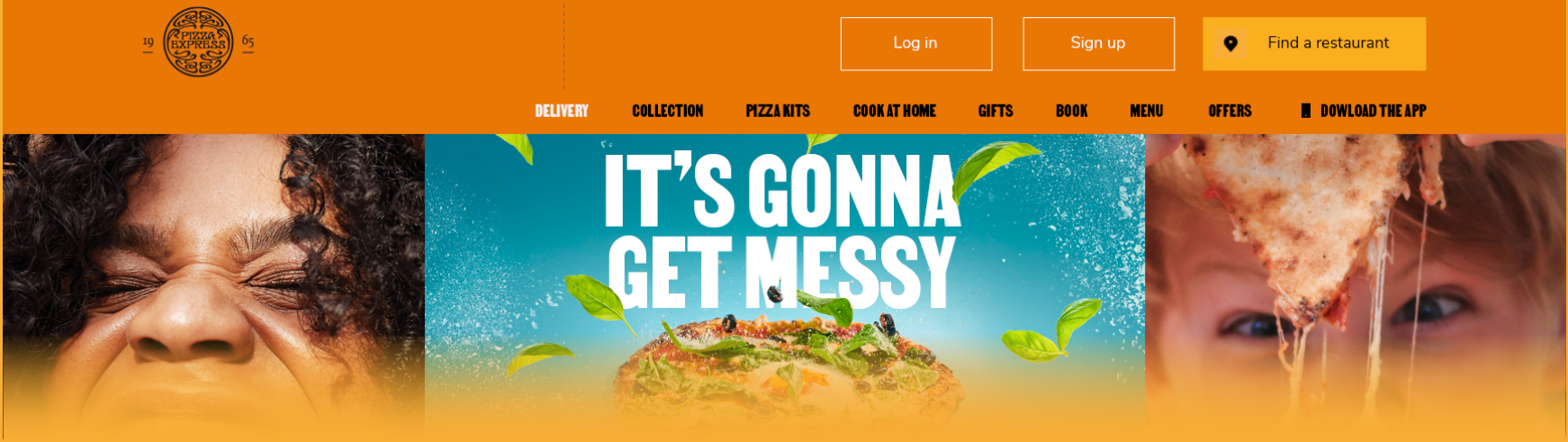
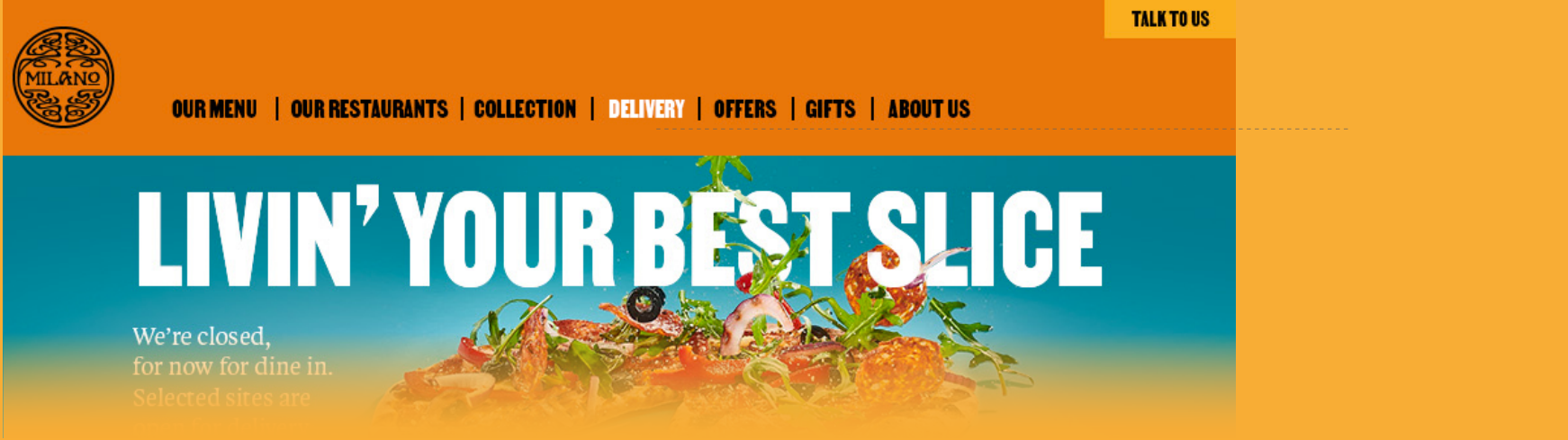
Top line navigation always sits in an orange header, with text links set in VTC Martin in black and a white hover and active state.
Layouts differ slightly between platforms (PE.com, Milano and Pay at Table), but the primary navigation stays the same throughout, so it reads as one brand wherever you land.
Header/footer
Navigation font: VTC Martin
(Inactive RGB 0/0/0 HEX 000000
Hover/active RGB 255/255/255 HEX FFFFFF)
PE.com example
Milano example
Rollover / active state:
white
Rollover / active state:
white
2LOGO POSITIONING
IN HEADERS
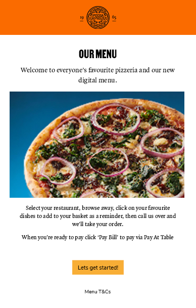
Ideally the logo sits centrally in the orange header.
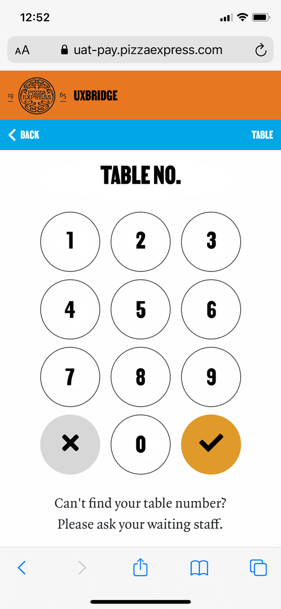
Some interfaces don't allow for that. In Pay at Table, once a restaurant has been selected, its location appears in the menu bar to the right of the logo. Centring both wouldn't look right, the bar can't be made any taller, and there isn't room to stack one above the other.
So in cases like this the logo moves to the left, which keeps the header balanced without losing either element.
Preferred logo position
Special exception logo position
3CTA HIERARCHY AND
INPUT FIELDS
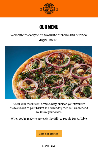
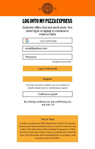
There are two types of CTA: primary, for the most affirmative action, and secondary, for anything of lesser importance.
Their colours are summarised below, and every CTA uses Nunito Sans Regular, the brand's functional ‘detail’ typeface.
They come in two widths. ‘Standard’ is the default and by far the most common. ‘Wide’ only appears alongside input fields and runs to the same width as them, so forms line up cleanly.
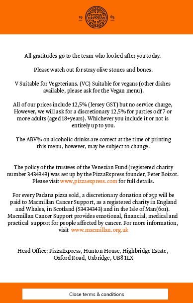
On the odd occasion a button has to sit in an orange footer, a yellow button would get lost, so a white Primary Exception CTA is used there instead.
Primary CTA(As per existing)
Secondary CTA(As per existing)
Primary Exception CTA
Standard CTA example
Wide CTA example
Primary Exception CTA example
Primary
‘Standard’ width CTA
Primary
‘Wide’ CTA
Secondary
‘Wide’ CTA
4MODAL POP UP WINDOWS
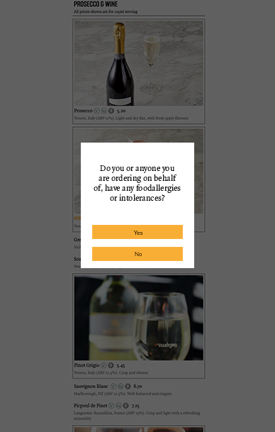
Modal pop-ups are always white, with headlines in VTC Martin and body copy in Quadraat Pro, both in black.
They appear on a dark overlay, so the message stands out clearly from the menu behind it.
CTAs inside them follow the same primary and secondary hierarchy as everywhere else.
Modal panel
Primary CTA(As per existing)
Secondary CTA(As per existing)
Headline font:
VTC Martin (RGB 0/0/0 HEX 000000)
Body copy font:
Quadraat Pro (RGB 0/0/0 HEX 000000)
Example with headline
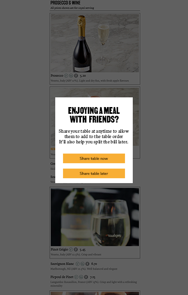
Example with no headline
5MENU LAYOUTS, COLOURS
AND HIERARCHY
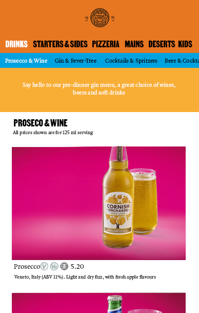
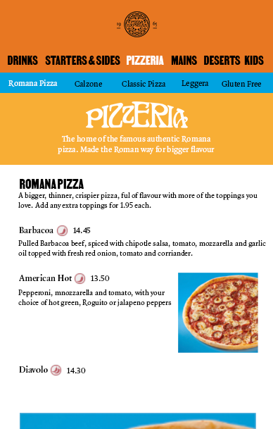
Headers and footers are orange on every platform, from the websites to table booking. Secondary information, such as collection times (see sections 6 and 7) or sub navigation, sits in a blue strip beneath.
Text links at both levels of navigation are black, with a white hover and active state. Primary links are set in VTC Martin and secondary links in Quadraat Pro, so the hierarchy is clear at a glance.
Header/footer
Secondary menu
Standout panel
Primary navigation font: VTC Martin
(Inactive RGB 0/0/0 HEX 000000
Hover/active RGB 255/255/255 HEX FFFFFF)
Secondary navigation font: Quadraat Pro
(Inactive RGB 0/0/0 HEX 000000
Hover/active RGB 255/255/255 HEX FFFFFF)
6CLICK AND COLLECT MENU
TYPOGRAPHY AND COLOUR
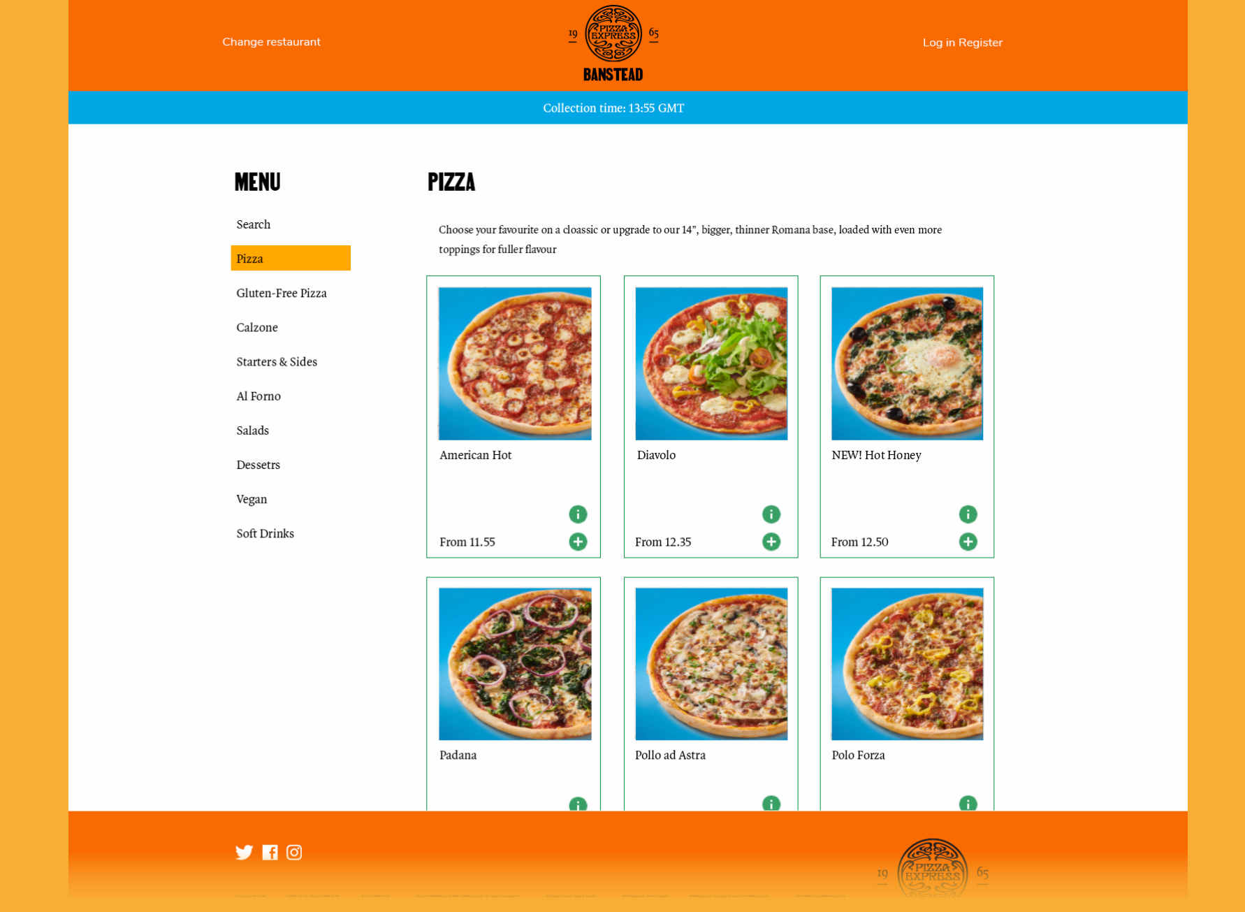
The click and collect menus on both the PizzaExpress and Milano websites have their main navigation on the page, down the left hand side.
To stay consistent with the brand guidelines, every H1, such as the ‘Menu’ header and the ‘Pizza’ category header, is set in VTC Martin. The navigation is set in Quadraat Pro, with a yellow background on hover and for the active item.
Menu cards have a green keyline and green icons.
Header/footer
Time stamp
Menu hover/ background state
Menu card
H1 font: VTC Martin
(Inactive RGB 0/0/0 HEX 000000
Hover/active RGB 255/255/255 HEX FFFFFF)
On page navigation font:
Quadraat Pro
RGB 0/0/0 HEX 000000
7HEADER/FOOTER VARIATIONS
Headers and footers vary between some platforms.
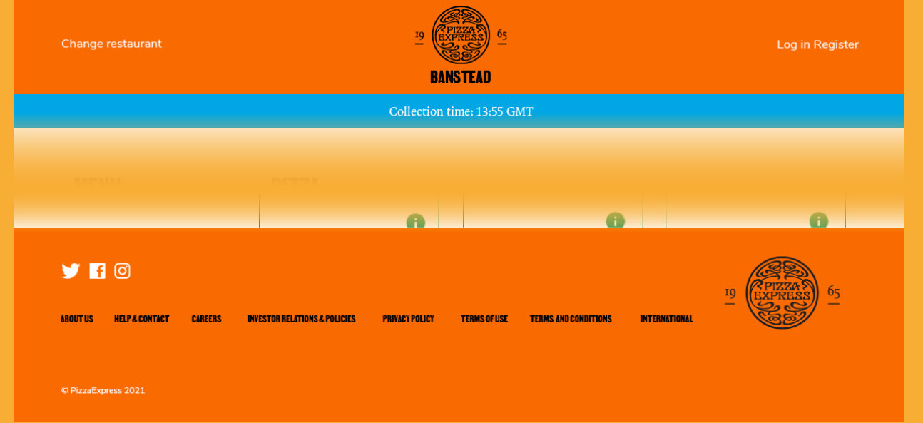
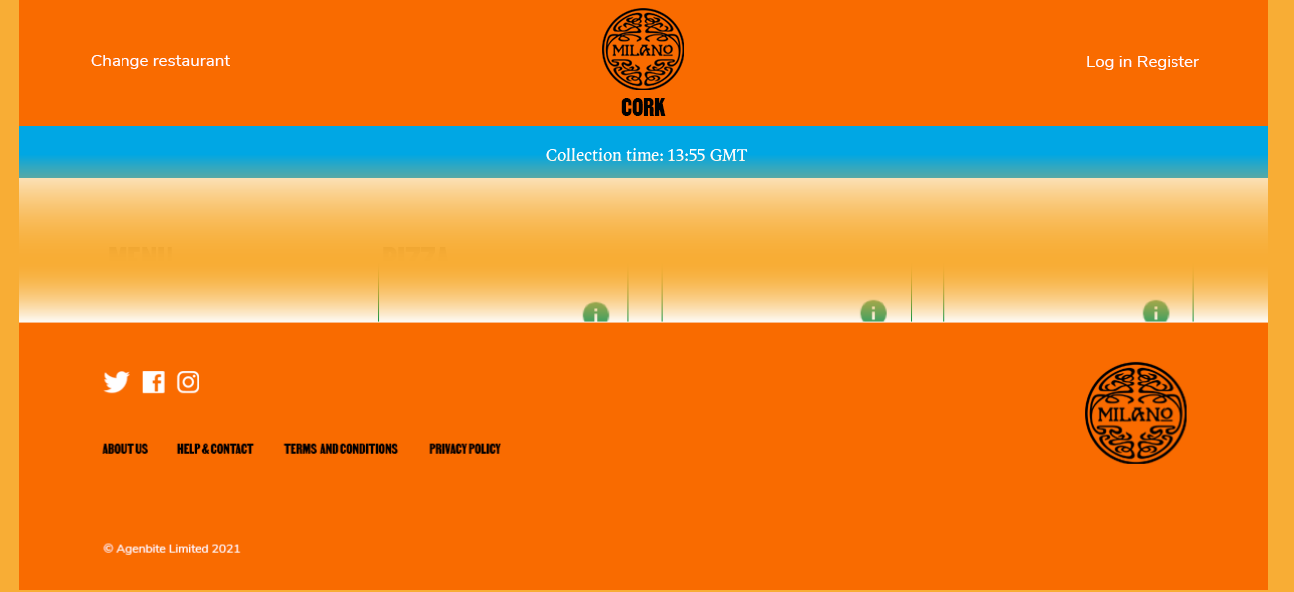
Milano and PizzaExpress have different navigation, for example, but in both the footer links are set in VTC Martin in black with a white hover and active state, which keeps them recognisably part of the same system.
Header/footer
Secondary menu
Footer navigation font: VTC Martin
(Inactive RGB 0/0/0 HEX 000000
Hover/active RGB 255/255/255 HEX FFFFFF)
A
B
USER EXPERIENCE
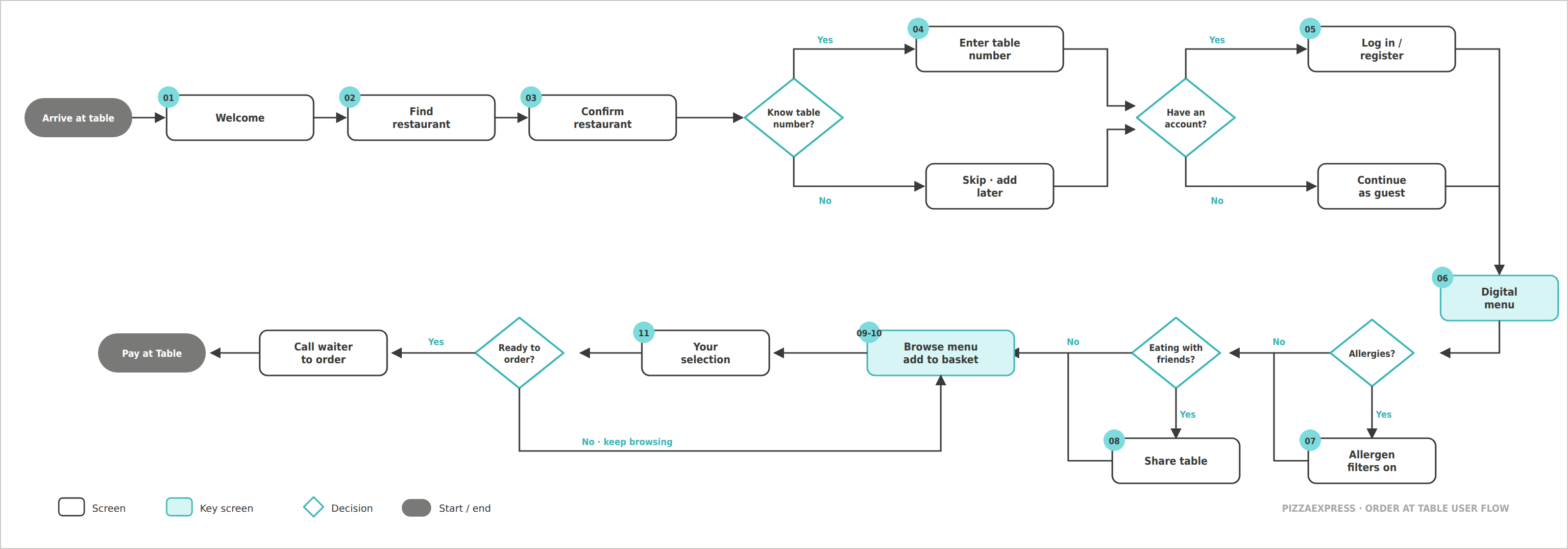
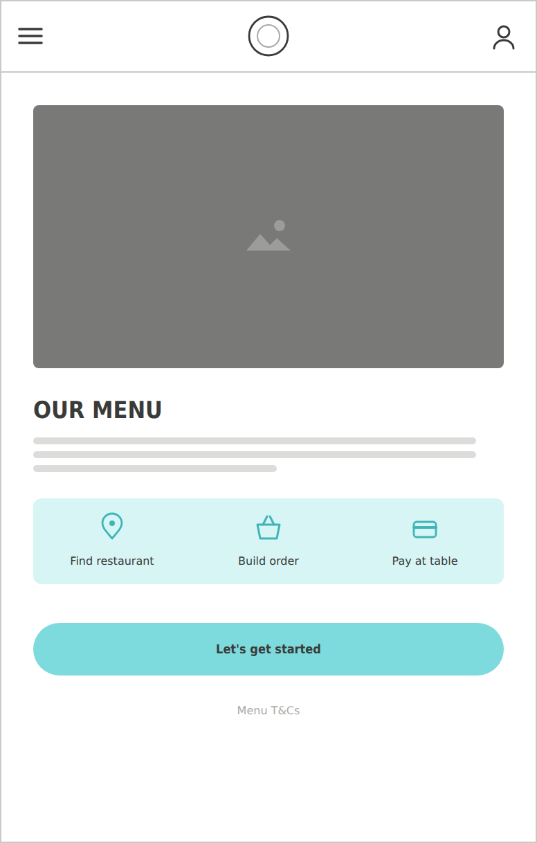
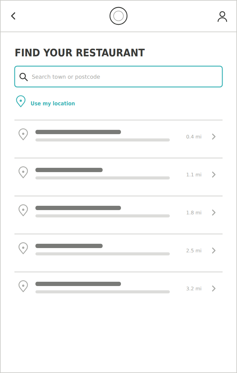
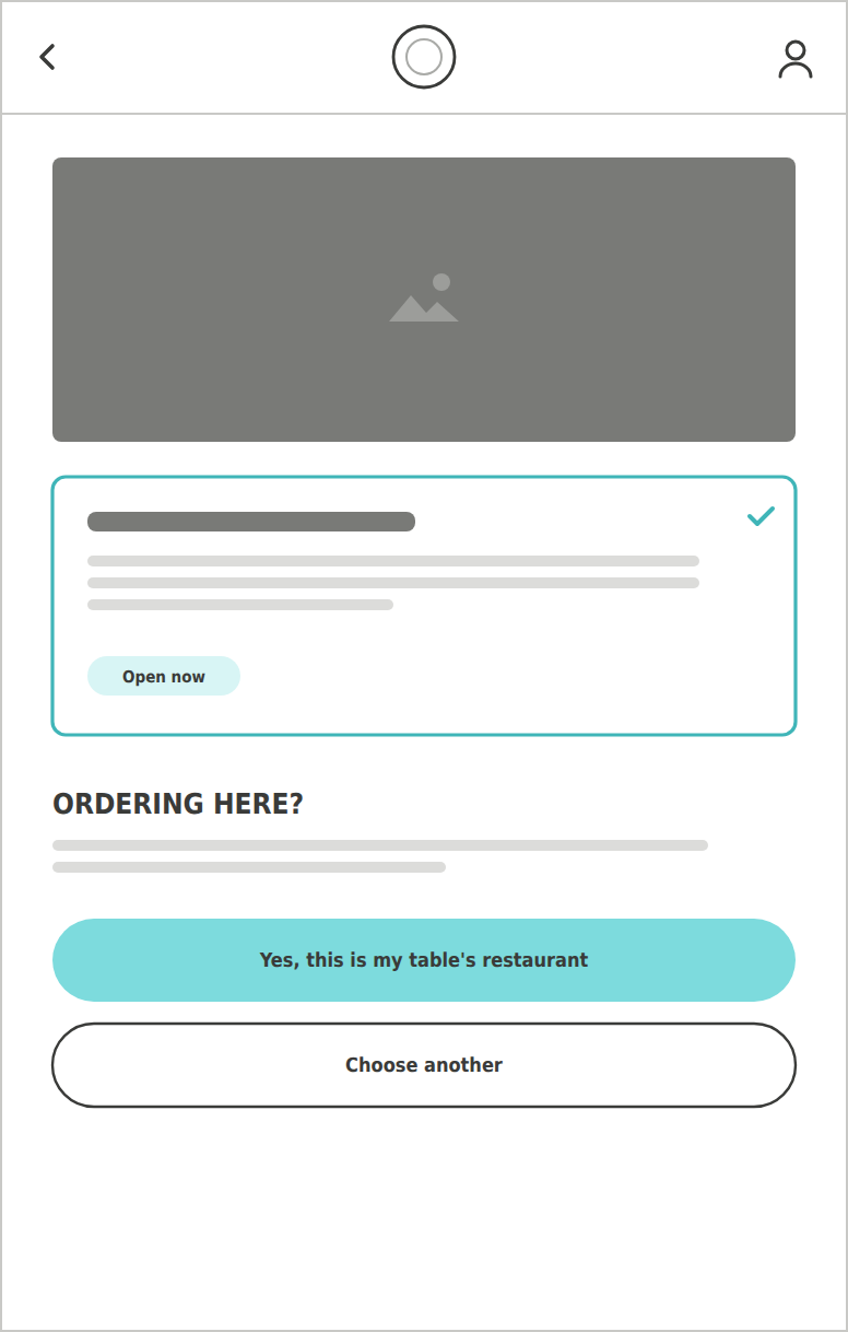
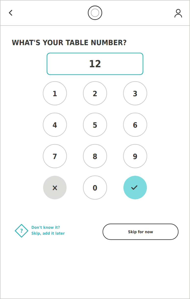
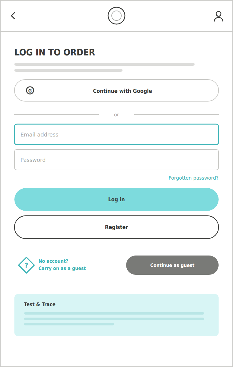
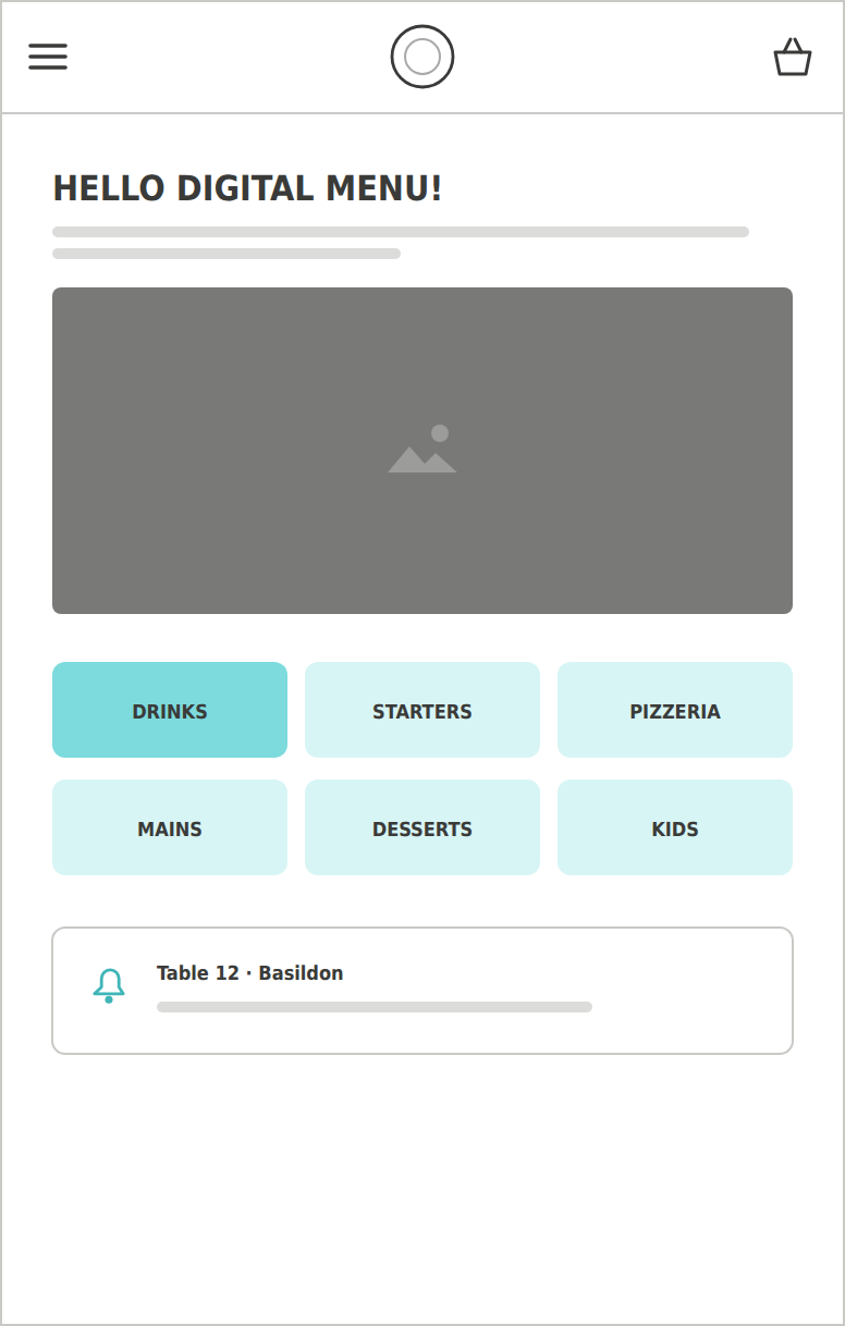
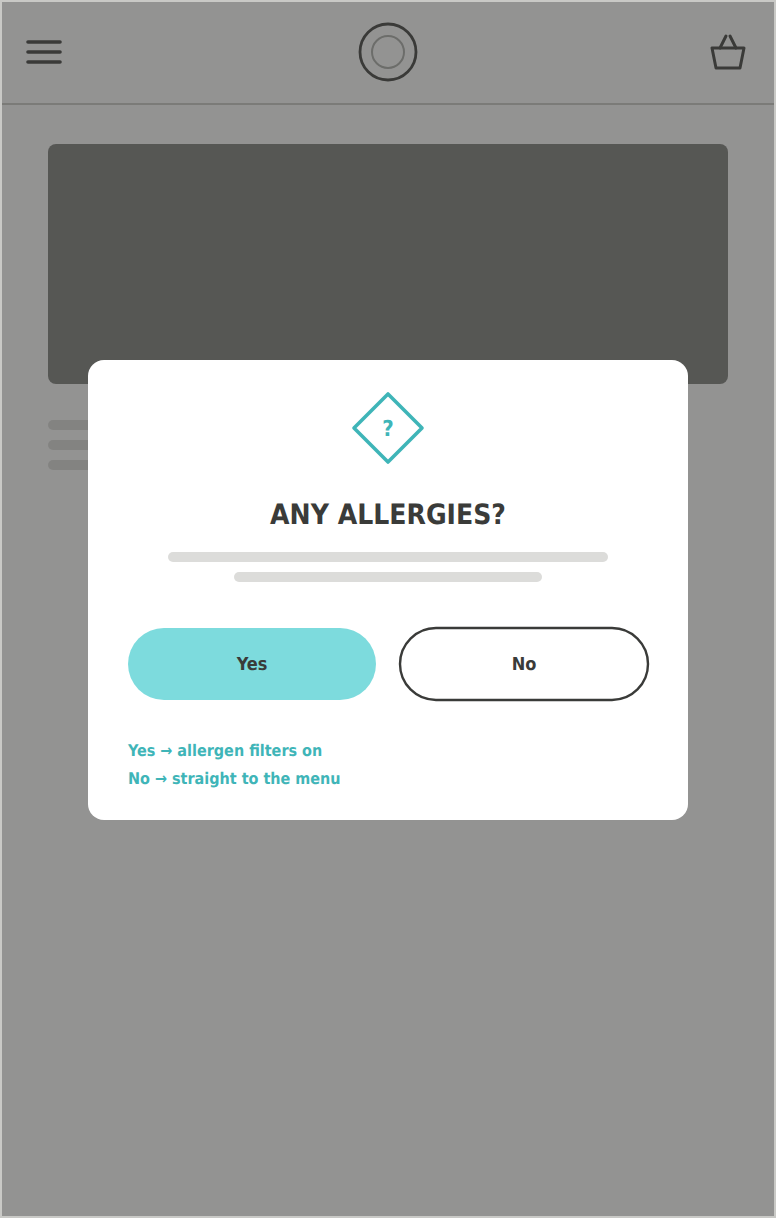
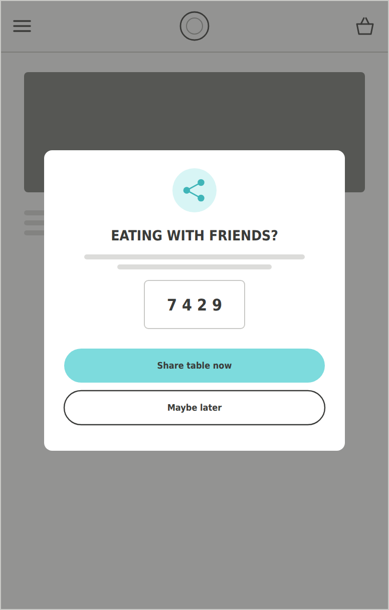
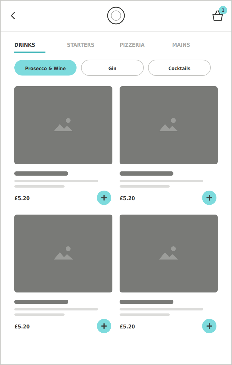
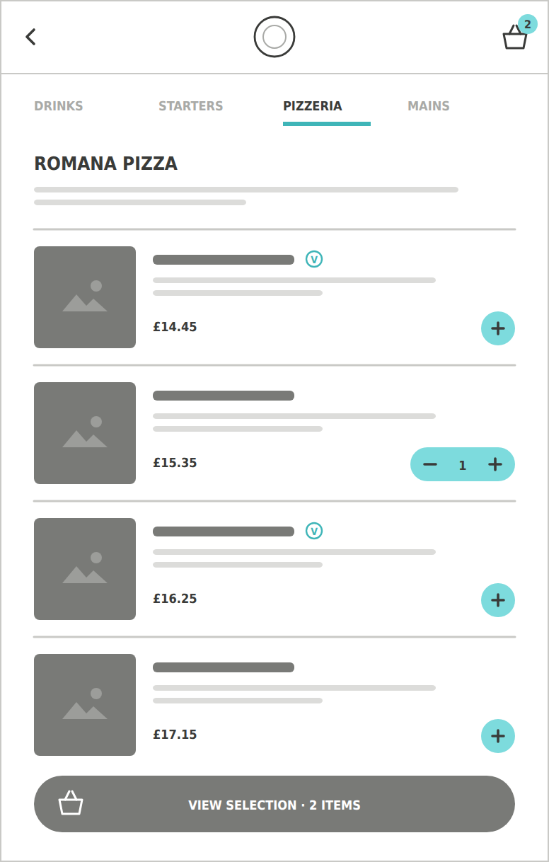
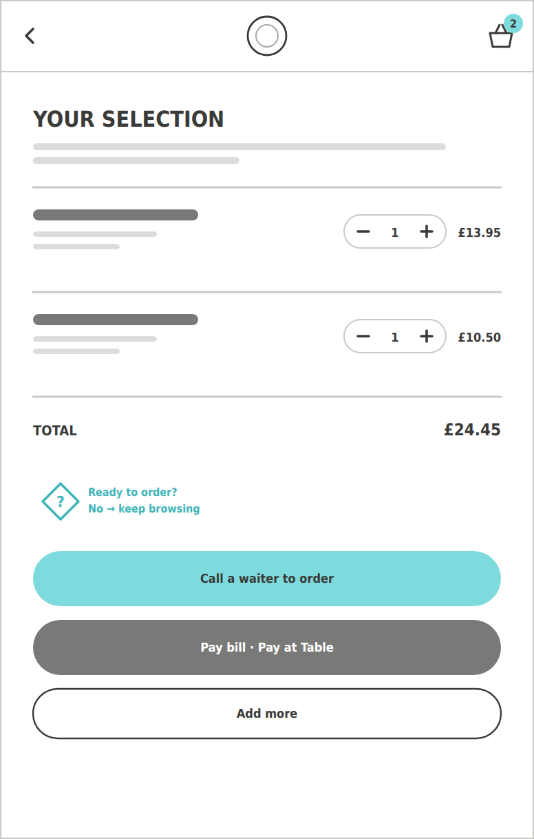
Order at Table let diners use the new digital menu on their own phones: find their restaurant, add a table number, log in or carry on as a guest, then add favourite dishes to a basket as a reminder before calling a member of staff over to order, and pay via Pay at Table. The user flow and wireframes below map that journey, with the decision points along the way.
Slightly different layouts exist between platforms (e.g. PE.com vs Milano vs Pay at Table) however this primary navigation remains consistent throughout.
PizzaExpress Digital Consistency Guidelines, 2021